


A strong logo and a recognizable brand identity is essential for brand voice. These examples show how the application of a strong logo within the right brand can launch or reinvent a company, and set it up for success by standing out in a cluttered visual landscape.
I developed the HopeBuilders logo to show that when you join as a HopeBuilder, your monthly donation helps directly address the affordable housing crisis in LA by supporting the work of Habitat for Humanity of Greater Los Angeles. The T shirt, phone case and tote allow supporters to wear their support with pride while looking fashionable.
These graphics represent part of a broader campaign to generate monthly donations while introducing the audience to the HopeBuilders brand.
I reimagined this B2B agency’s brand, giving them a new logo, and setting them up for success with a modern look & feel that incorporated a warm color palette, a futuristic geometric mesh texture, and a circular motif throughout.
The New England Women in Energy & the Environment needed a new logo, so after listening to their needs, values and goals this finalized logo was delivered to their delight. Modern and sleek, with an emphasis on the heroic “W” for Women, this logo has become synonymous with who they are and what they stand for.
This page was taken from the larger document created for NEWIEE, the brand guidelines. In it the usage rules for the new brand is spelled out exactly in order to maintain consistency and cohesion for the brand going forward.
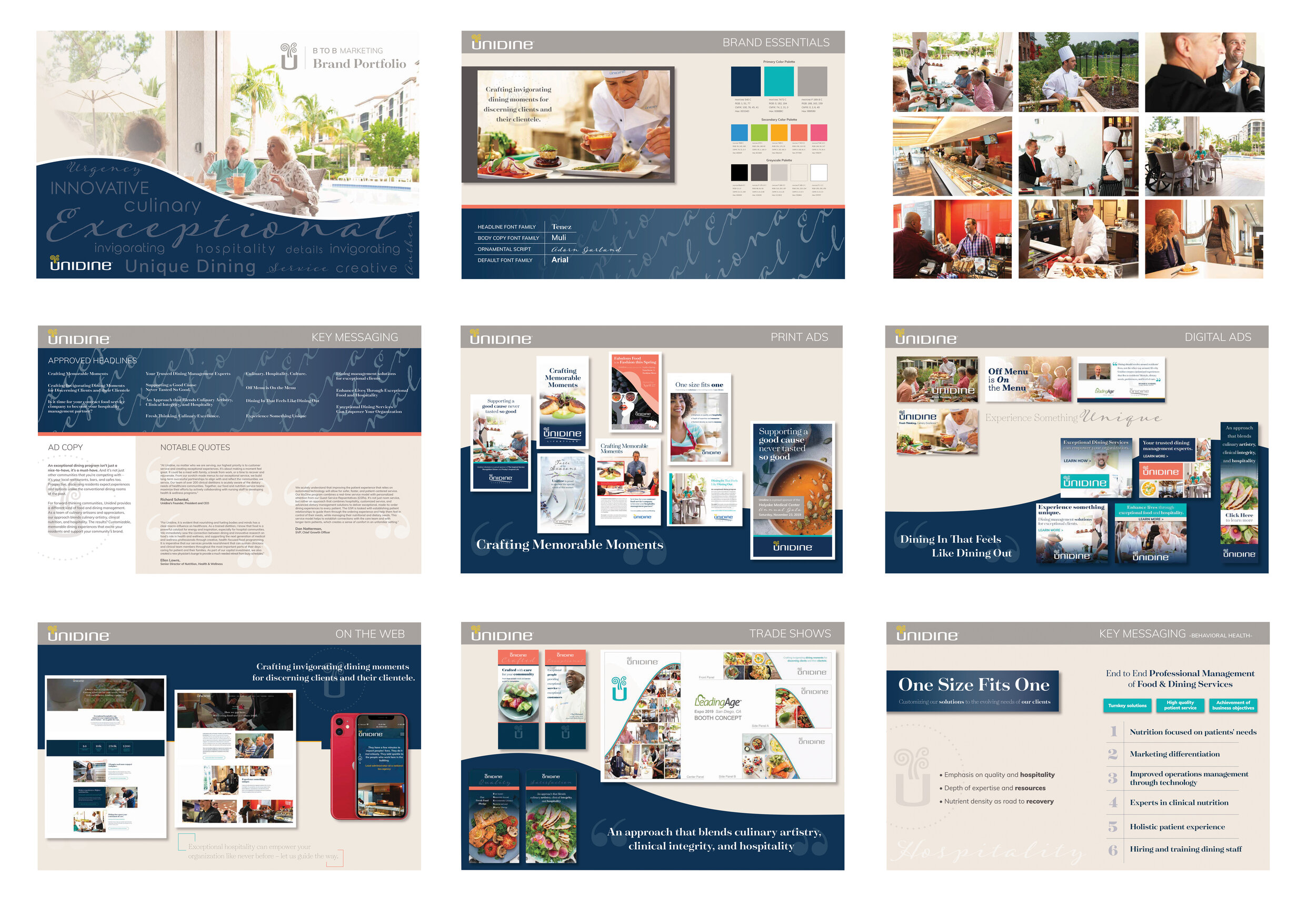
This book compiles key messaging, graphics, photos, and style elements for the B to B marketing team at Unidine. This serves as a guide for all outgoing collateral for the brand and maintains brand voice. I designed all graphics seen on the pages of this portfolio, and it represents some of my most recent brand work.
This logo was chosen by Long Falls Paperboard, as part of their their brand refresh. A style guide / brand guidelines was designed for their usage in maintaining the new brand going forward.
This brand guidelines sheet was developed for the company’s use in keeping their new brand consistent going forward.
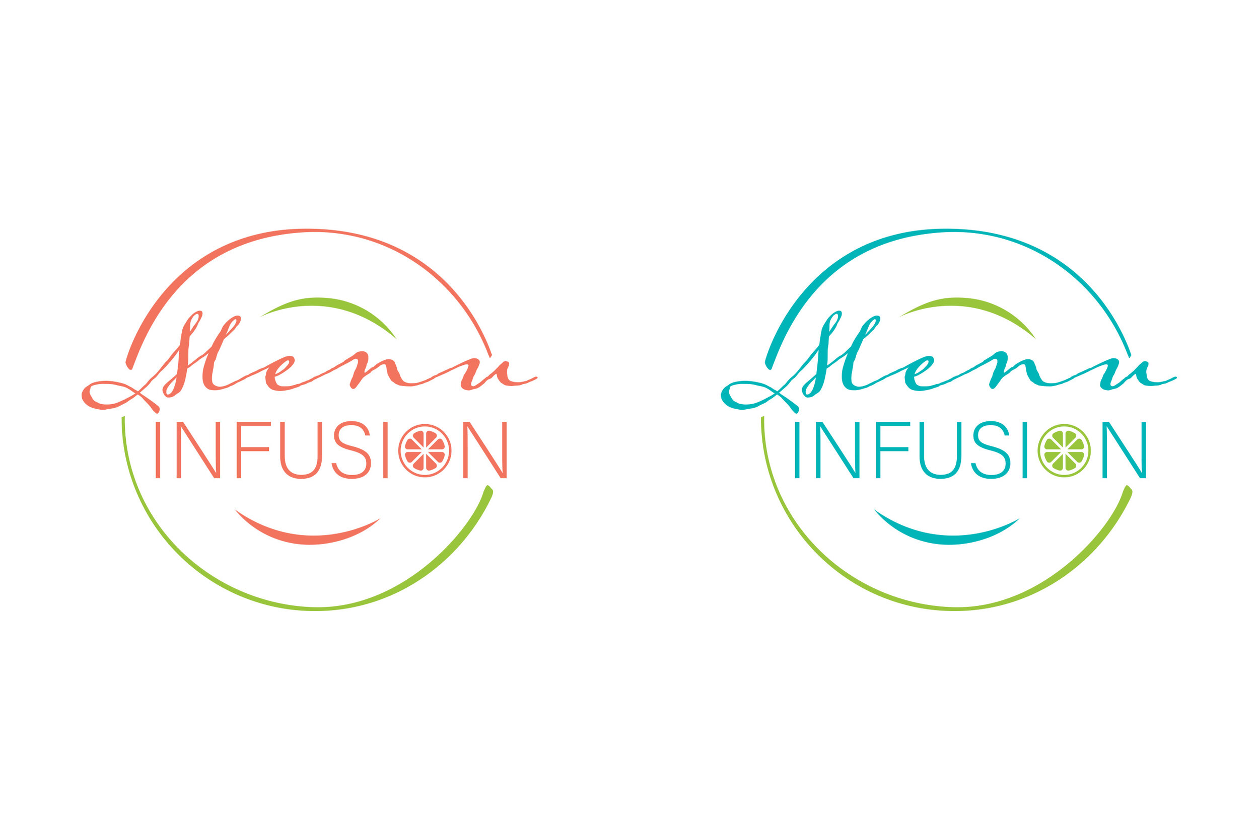
A logo I developed that represents a program of augmenting existing monthly menus with fresh ingredients, flavors and elements. Two colorways are seen here.
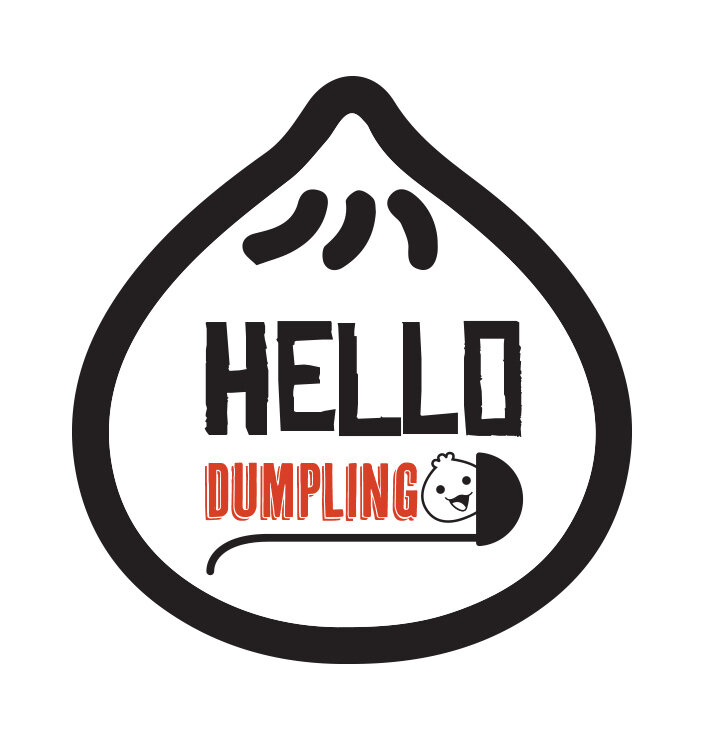
Hello Dumpling was a themed monthly meal program that involved a variety of Asian street food-style dumplings. This logo captures the playfulness of Japanese pop culture and suggests the shape of the food itself.
This logo design incorporated a CMYK color scheme to catch the eye, but works just as well, -if not stronger- in black. the prominent 2 ovals represent the holes of the bead; and the faceted dome of the bead immediately pops and show the unique features of its exclusive design.
Tango bead was the company's first exclusive bead, and it's defining feature was that it was a right angle shaped bead, that could be turned and used in various different configurations. I highlighted this feature by rotating the red triangles within each character of the logo.